
Spatial Contiguity Principle: Difference between revisions
| Line 51: | Line 51: | ||
[[File:Spatial contiguity 2.png|thumb|250px|link=https://www.youtube.com/watch?v=IPvfYLnihHc|Spatial contiguity[https://www.youtube.com/watch?v=IPvfYLnihHc| Direct YouTube link]]] | [[File:Spatial contiguity 2.png|thumb|250px|link=https://www.youtube.com/watch?v=IPvfYLnihHc|Spatial contiguity[https://www.youtube.com/watch?v=IPvfYLnihHc| Direct YouTube link]]] | ||
[[[File:Spatial contiguity 4.png|thumb|250px|link=https:// | [[[File:Spatial contiguity 4.png|thumb|250px|link=https://apps.apple.com/ca/app/visual-anatomy-lite/id523422151|VisAnatomyLite APP]]] | ||
==='''Use Diagram to Introduce Our Brain'''=== | ==='''Use Diagram to Introduce Our Brain'''=== | ||
Revision as of 18:50, 16 December 2022
Overview

Students learn better when corresponding words and pictures are presented near each other than far from each other on the page or screen(Mayer et al. 1989).
As one of Mayer's 12 Principles of Multimedia Learning, the Spatial Contiguity Principle refers to a close together distance in the actual space between relevant text and visuals on the screen. When the corresponding words and pictures are far from each other, we define it as separated presentation. Spatial contiguity is created when we use an integrated presentation in which each illustration is placed next to the text that describes it, and words have been inserted into the illustration. By this, Learners have cues for combining corresponding words and images that save their working memory during cognitive processing. This principle is important to consider when developing e-learning modules because it allows for meaningful learning by creating a mental connection between words and images.
Evidence

Placing printed words near the graphics they describe to guide the learner's cognitive processing helps to reduce extraneous processing.
There are 22 tests of the spatial contiguity principle in the research(Table 12.7). For example, in Mayer's study(1989), students trad a paper-based lesson on how brakes work and then need to take a transfer test. Some of the students(Integrated group) were provided with words describing the action and were placed next to the corresponding part of an illustration. Others(Separated groups) received each picture that was placed at the top of a page and the corresponding words were separated and placed in a paragraph at the bottom of the page. The result shows that the integrated group performed much better than the separated group on a transfer test.
The spatial contiguity principle represents a subset of what Ayres and Sweller call the split-attention principle. The split-attention principle refers to 'avoiding formats that require learners to split their attention between, and mentally integrate, multiple sources of information.'
Four Possible Boundry Conditions
The spatial contiguity principle has four possible boundary conditions: low prior knowledge, nonredundant text and images, complex lessons, and interactive formats.
Low Prior Knowledge
Mayer and colleagues discovered in 1995 that integrated presentations were more effective than separate presentations for low-priority knowledge learners but not for high-priority knowledge learners, supporting the expertise reversal principle.
nonredundant text and pictures
According to Ayres and Sweller, the spatial contiguity principle is most useful when multiple sources of information would be incomprehensible in isolation. It makes no difference if the words are presented in a separated format if they are not required to understand the graphic.
Complex Lessons
Ayres and Sweeler also stated that the spatial contiguity principle applies when the material is complex, but may not apply when the material is so simple that separated design does not overload the cognitive system.
Interactive Formats
Some evidence suggests that the spatial contiguity principle can be strengthened when learners create integrated presentations by moving text to relevant portions of a graphic on tire pumps, according to studies conducted by Bodemer and colleagues in 2004.
Implication Guidelines
Pop-Up Windows
- Make sure questions and corresponding answers are placed on the same page
- Do not use multiple tabs, and use linked windows so that readers can see the answers to posing questions without scrolling over various pages or tabs
Text and Animations
- Use animation formats' materials to provide readers with a visual representation of the context
- Display text and animations together
- Need to have a 'Play' bottom to control the animation as the text is a still present
Too Much Text and Rool Over Effect
- Too much text can overwhelm the readers and make the content to be less visually appealing for readers
- When the cursor is hovering over the corresponding graphics, the Roll Over or Mouse Over effect displays the same information because it is displayed in a pop-up type message.
Design Implication
[[[File:Spatial contiguity 4.png|thumb|250px|link=https://apps.apple.com/ca/app/visual-anatomy-lite/id523422151%7CVisAnatomyLite APP]]]
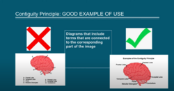
Use Diagram to Introduce Our Brain
On the left diagram, the letter and the terms are separated from each other while on the right one the terms are directly linked to the corresponding part of the image. The right diagram is more useful that helping the learners to remember and shape the connection between information.
Contiguity Principle in VisAnatomyLite
This app employs 3D diagrams of various body parts, and when you click a specific area on the diagram, the correct term appears. This is an excellent example of The Contiguity Principle in action because it displays both images and text while ensuring that the corresponding words are linked to the images.
Reference
Mayer’s 12 Principles of Multimedia Learning: Introduction. (n.d.-b). https://www.skillsandparticipation.co.uk/mod/book/view.php?id=11085